Why Image Format Matters for Web Performance
Images are the single largest contributor to page weight on the modern web. On average, images account for 50 to 70 percent of the total bytes transferred when a webpage loads. The format you choose for each image directly determines how large that file is, how quickly it downloads, and how fast your page renders for real users. Choosing the best image formats for web performance is not an aesthetic decision it is a technical one with measurable consequences for your users and your business.
Impact on Page Speed and Loading Time
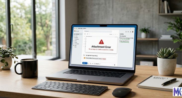
Every additional kilobyte your browser must download before displaying a page adds to its load time. When a user visits your website, their browser makes individual requests for every image on the page. If those images are saved in inefficient formats or are uncompressed, the total download size increases significantly, and users experience a visibly slower website.
Research consistently shows that users abandon websites that take more than three seconds to load. A page with five unoptimized JPEG images totaling 3 MB will load dramatically slower than the same page with those images converted to WebP at 700 KB combined. The difference in perceived speed is not subtle it is the difference between a user staying on your page and a user bouncing back to the search results.
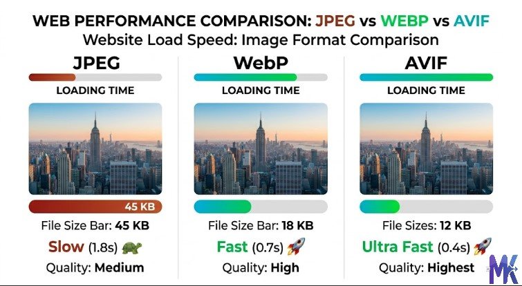
Image format choice also affects Time to First Byte (TTFB) indirectly, because large image files stress server resources and CDN bandwidth. Beyond raw download speed, the format also determines how quickly the browser can decode and render the image once it is downloaded. Formats with simpler decoding algorithms (like JPEG) require less CPU time to render, while more modern formats (like AVIF) may take more processing power to decode despite smaller file sizes.
How Images Affect Core Web Vitals (LCP, CLS, INP)
Google’s Core Web Vitals are the primary technical signals used to measure page experience, and images directly affect all three metrics. Largest Contentful Paint (LCP) measures how long it takes for the biggest visible element on the page to load. In the vast majority of websites, that biggest element is an image a hero banner, a featured photo, or a product image. A poorly optimized image in the wrong format can push LCP from under 2.5 seconds (good) into the 4+ second range (poor), directly harming your Google rankings.
Cumulative Layout Shift (CLS) measures visual stability whether elements jump around as the page loads. Images without defined width and height attributes cause layout shifts because the browser does not know how much space to reserve until the image loads. This is a format-agnostic issue, but it is most severe with large, slow-loading images in formats like PNG and uncompressed BMP that take longer to arrive.
Interaction to Next Paint (INP) measures responsiveness. While INP is primarily affected by JavaScript, heavy images can indirectly degrade it by consuming main thread and rendering resources, especially on lower-end mobile devices. Optimizing images including choosing efficient formats reduces the overall rendering burden and keeps the main thread available for handling user interactions.
Mobile Internet Users in India: Why Optimization Is Critical
India has one of the largest and fastest-growing mobile internet user bases in the world, with hundreds of millions of people accessing the web primarily through smartphones on 4G connections, and a significant portion still on 3G in rural areas. This creates a unique performance challenge for website owners targeting Indian audiences.
A 2 MB hero image that loads acceptably fast on a fiber connection in a metro city will load agonizingly slowly for a user in a tier-2 or tier-3 city on a congested mobile network. For Indian web developers and website owners, choosing the best image formats for web performance is not optional it is essential to reaching the majority of your potential audience.
Data costs also remain a consideration for many Indian mobile users. Unnecessarily large images not only slow down your site but also consume users’ mobile data, which directly affects user experience and satisfaction. Formats like WebP and AVIF, which can deliver the same visual quality at 30 to 70 percent smaller file sizes compared to JPEG and PNG, are particularly impactful for the Indian market.
High-Resolution & Retina Screens: Hidden Performance Cost
Modern smartphones and laptops use high-DPI or Retina displays that have pixel densities of 2x, 3x, or even 4x compared to standard screens. This means that to look sharp on a Retina display, your images need to be supplied at 2x or 3x the displayed dimensions. A logo displayed at 200 x 100 pixels on screen needs to be 400 x 200 pixels at 2x to look crisp on a Retina device.
This creates a hidden performance cost. Websites that naively serve 3x resolution images to all devices including those that do not need them are sending unnecessarily large files to the majority of their users. The correct solution is to use responsive images with the srcset attribute to serve appropriately sized images based on the device’s pixel ratio. When combined with modern formats like WebP and AVIF, this approach delivers sharp images on high-DPI screens without penalizing users on standard-density displays.
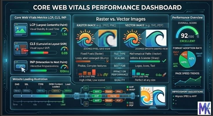
Raster vs Vector Images (Foundation You Must Understand)
What Are Raster Images?
Raster images are made up of a grid of individual colored pixels. Each pixel stores color information, and together they form the complete image. The quality and sharpness of a raster image is determined by its resolution the total number of pixels and it cannot be scaled up without losing quality because the browser has to interpolate (guess) the color values of new pixels during enlargement.
All photographs are raster images. Common raster formats include JPEG, PNG, WebP, AVIF, GIF, and BMP. When you zoom into a raster image far enough, you will eventually see the individual square pixels that make up the image. Raster images are ideal for photographs and complex visual content where continuous gradients, shadows, and realistic color transitions are required.
What Are Vector Images?
Vector images are defined by mathematical formulas rather than individual pixels. They describe shapes, lines, curves, and fills using equations, which means they can be scaled to any size from a postage stamp to a billboard without any loss of quality. The file stores the instructions for drawing the image, not the pixels themselves.
SVG (Scalable Vector Graphics) is the primary vector format for the web. Logos, icons, illustrations, charts, and diagrams are all excellent candidates for vector format. Because SVG files store mathematical descriptions rather than pixel data, they are often dramatically smaller than raster equivalents for simple graphics a logo saved as SVG might be 5 KB, while the same logo saved as a high-resolution PNG might be 80 KB.
When to Use Raster vs Vector for Speed
The decision between raster and vector depends entirely on the type of image. Use vector (SVG) for logos, icons, simple illustrations, charts, flags, and any graphic that needs to look sharp at multiple sizes. SVG files scale perfectly, are small in file size for simple graphics, and can be styled and animated with CSS.
Use raster for photographs, realistic product images, detailed illustrations with complex gradients, and any content where the visual complexity exceeds what vector formulas can efficiently describe. For raster images, always choose the most efficient format available WebP or AVIF in 2026, with JPEG as a fallback for older browsers.
Never use raster formats for logos or icons. A PNG logo at 5000 x 5000 pixels to ensure sharpness on Retina screens creates an unnecessarily large file. The same logo as an SVG will be sharp at any resolution and potentially ten times smaller in file size.
Lossy vs Lossless Compression Explained
What Is Lossy Compression?
Lossy compression permanently removes data from an image to achieve a smaller file size. The compression algorithm analyzes the image and discards information that human vision is least likely to notice typically fine details in areas of uniform color, subtle variations in dark shadows, and high-frequency texture details. Once this data is removed and the image is saved, the original full-quality data cannot be recovered.
JPEG is the most well-known lossy format. When you save a JPEG at 80 percent quality, the encoder discards approximately 20 percent of the visual data. At 60 percent quality, the compression is more aggressive and visible artifacts blocky patterns, color banding, and blurring around edges begin to appear. WebP and AVIF also support lossy compression and achieve significantly better quality-to-file-size ratios than JPEG at equivalent quality settings.
The key advantage of lossy compression is dramatically smaller file sizes. The key disadvantage is that quality degradation is irreversible, and repeatedly saving a lossy image (such as editing and re-saving a JPEG multiple times) causes progressive quality loss with each save cycle.
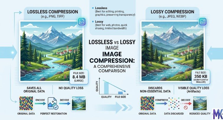
What Is Lossless Compression?
Lossless compression reduces file size by identifying and encoding redundant patterns in the image data without discarding any information. The original pixel data can be perfectly reconstructed from a lossless compressed file. If you open a lossless image, edit it, and save it again as lossless, there is no quality degradation.
PNG is the most common lossless format for the web. WebP also supports a lossless mode. Lossless compression is less effective at reducing file sizes than lossy compression a lossless PNG will typically be significantly larger than a lossy JPEG or WebP of the same image at acceptable visual quality.
Lossless compression is ideal for images that contain text, sharp geometric shapes, logos, screenshots, and other content where even minor pixel-level changes would be visually noticeable. For photographs, lossless compression produces unnecessarily large files because the human eye cannot detect the fine detail that lossy compression removes.
Which One Is Better for Web Performance?
For web performance, lossy compression at high-quality settings (75 to 85 percent) almost always wins for photographic content. The file size reduction compared to lossless is enormous, and the visual difference at quality settings above 75 percent is imperceptible to most users on typical screens.
Lossless compression is the better choice for screenshots, UI images, logos in raster format, and any image where text or fine geometric details must be pixel-perfect. For these use cases, lossy compression introduces artifacts that are clearly visible and degrade the professional appearance of the content.
The practical rule is: use lossy compression (WebP or AVIF) for photos, and use lossless compression or vector (SVG) for graphics and UI elements.
Complete Guide to Image File Formats
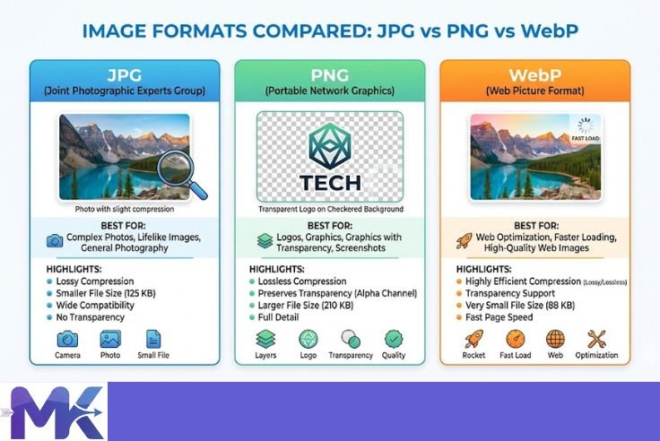
JPEG (JPG) – The Classic Web Format
How JPEG Compression Works
JPEG compression works through a multi-step process that exploits properties of human vision. The image is first converted from RGB color space to YCbCr, which separates brightness (luminance) from color (chrominance) information. Human eyes are more sensitive to brightness than to color detail, so JPEG compresses color information more aggressively than brightness.
The image is then divided into 8 x 8 pixel blocks, and each block undergoes a mathematical transformation called the Discrete Cosine Transform (DCT), which converts the pixel data into frequency components. High-frequency components representing fine detail are then discarded according to the quality setting at lower quality settings, more high-frequency data is discarded, producing the characteristic blocky JPEG artifacts. The remaining data is then encoded using Huffman coding for the final file.
This process is why JPEG is excellent for photographs with gradual color transitions but poor for images with sharp edges, text, or flat areas of uniform color, where the 8 x 8 block artifacts become clearly visible.
Pros
The advantages of JPEG include universal browser and device support dating back to the early 1990s, excellent compression efficiency for photographic content, wide tooling support across every image editor and platform, and progressive JPEG support which allows images to load blurry and sharpen as more data arrives.
Cons
The disadvantages include no support for transparency (alpha channel), which makes it unusable for logos with transparent backgrounds. Quality degradation with repeated saves (generation loss) is a significant workflow issue. JPEG performs poorly on images with sharp edges, text, or large areas of flat color. It is also a 25-year-old format, and newer formats like WebP and AVIF significantly outperform it in compression efficiency.
Best Use Cases
JPEG remains a valid choice in 2026 for photographs where transparency is not needed and where you need guaranteed compatibility with all devices and browsers. Blog post photos, article header images, and background images are all reasonable JPEG use cases when serving older browsers. However, for any modern website, JPEG should be treated as the fallback format for browsers that do not support WebP or AVIF, not as the primary delivery format.
PNG – High Quality with Transparency
PNG (Portable Network Graphics) uses lossless compression and supports full alpha channel transparency, making it the standard format for graphics, logos, UI elements, and screenshots that require a transparent background.
Pros
The advantages of PNG include perfect lossless quality with no compression artifacts, full 8-bit alpha transparency support for smooth semi-transparent edges, excellent quality for images with text, sharp edges, and flat areas of color, and wide universal browser support.
Cons
The disadvantages are significant for web performance. PNG files are substantially larger than JPEG or WebP for photographic content often three to five times larger. PNG has no native animation support beyond the limited APNG variant. Because it is lossless, it cannot achieve the file size reductions that even moderate lossy compression provides, making it a poor choice for any photograph or complex image where transparency is not required.
When NOT to Use PNG
Never use PNG for photographs, hero banners, blog post images, or any raster content where transparency is not required. A high-quality photograph saved as PNG will be three to ten times larger than the same image saved as WebP at 85 percent quality. This is one of the most common and costly image optimization mistakes on the web.
Also avoid PNG for very large or complex illustrations where SVG is not feasible in these cases, WebP with lossless mode offers comparable quality with better compression than PNG.
WebP – The Modern Standard
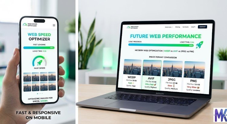
WebP was developed by Google and released in 2010. It has matured into the most broadly supported modern image format and is widely considered the current best image format for web performance for the majority of use cases.
Why WebP Is Better Than JPEG and PNG
WebP uses a more advanced compression algorithm based on the VP8 video codec for lossy compression, and a variant of the PNG algorithm for lossless compression. The result is that WebP produces files that are 25 to 35 percent smaller than JPEG at comparable visual quality for lossy compression, and 26 percent smaller than PNG for lossless compression.
WebP also supports transparency (alpha channel) in both lossy and lossless modes, animation, and metadata storage. This means WebP can replace JPEG, PNG, and GIF with a single format that outperforms all three in file size.
Pros and Cons
The advantages of WebP include superior compression over JPEG and PNG, full transparency support (replacing PNG), animation support (replacing GIF), excellent browser support in 2026 covering all major browsers, and support for both lossy and lossless compression modes.
The disadvantages include the fact that WebP is not supported in very old browsers (Internet Explorer 11 is the most notable holdout, though IE is effectively dead in 2026). WebP also does not compress quite as aggressively as AVIF, the next-generation format. Some older image editing tools have limited WebP support, though this has improved dramatically in recent years.
Browser Support in India
As of 2026, WebP is supported by all major browsers used in India including Chrome (which dominates the Indian browser market at approximately 65 percent market share), Firefox, Safari, Edge, Opera, and Samsung Internet. Given that Chrome and Chrome-based browsers account for the overwhelming majority of web traffic in India, WebP support is effectively universal for Indian audiences. Safari added full WebP support in 2020, and Samsung Internet popular on affordable Android devices in India has supported WebP since 2019.
AVIF – Next-Gen Image Format
AVIF (AV1 Image File Format) is derived from the AV1 video codec developed by the Alliance for Open Media. It represents the current state of the art in image compression and produces the smallest file sizes at equivalent visual quality of any widely deployed image format.
Compression vs WebP
AVIF typically achieves 30 to 50 percent smaller file sizes compared to WebP at equivalent visual quality, and 50 to 70 percent smaller than JPEG. At low quality settings, AVIF also avoids the blocky artifacts characteristic of JPEG, instead producing a softer, more natural degradation that is generally less objectionable to viewers.
AVIF’s superior compression comes from the AV1 codec’s more sophisticated encoding algorithms, which analyze larger blocks of image data and use more complex prediction methods than the algorithms underlying JPEG or WebP. The trade-off is that AVIF encoding is significantly more CPU-intensive and slow compared to JPEG and WebP, which can be a concern for server-side on-the-fly conversion.
Pros and Cons
The advantages of AVIF include the best compression ratio of any mainstream web image format, full transparency support, animation support, HDR and wide color gamut support (useful for high-end photography and product imagery), and growing browser support.
The disadvantages include slower encoding times compared to JPEG and WebP, meaning on-the-fly conversion requires more server resources. Browser support, while improving, is not yet as universal as WebP. Additionally, very high-resolution AVIF images can sometimes take longer to decode on lower-end devices, which could negatively impact LCP on budget Android smartphones an important consideration for Indian websites.
Should You Use AVIF in 2026?
Yes, AVIF is worth using in 2026, but with fallbacks. The recommended approach is to serve AVIF to browsers that support it, WebP to browsers that support WebP but not AVIF, and JPEG as the final fallback. This is easily implemented using the HTML picture element. For static images that can be pre-converted, AVIF offers meaningful file size savings that translate directly to faster loading pages. For image-heavy e-commerce sites, the cumulative bandwidth savings from AVIF can be substantial.
GIF – For Basic Animations
GIF (Graphics Interchange Format) is one of the oldest web image formats, dating to 1987. It supports animation, which is why it remains in use despite being technically inferior to every modern format. GIF uses lossless compression but is limited to a palette of only 256 colors per frame, making it extremely poor for photographic content.
Limitations
GIF’s 256-color limit produces visible color banding and dithering on any image with smooth color gradients. GIF animation files are notoriously large a 10-second animated GIF can easily be 5 to 15 MB, making it one of the worst performance offenders on the web. GIF also has no true transparency, supporting only binary on/off transparency rather than smooth alpha transparency, which results in jagged edges around transparent areas.
Better Alternatives
For animations, WebP animated and AVIF animated formats offer the same animation capability with dramatically smaller file sizes typically 60 to 80 percent smaller than GIF. For short, looping animations that were previously served as GIFs, the HTML video element with an MP4 or WebM file is often the best performance choice, with file sizes up to 90 percent smaller than the equivalent GIF. Modern browsers can autoplay muted, looping videos inline in content just like GIFs. There is virtually no legitimate use case for GIF on a performance-optimized website in 2026.
SVG – Best for Logos and UI
SVG (Scalable Vector Graphics) is an XML-based vector image format. Because SVG images are described mathematically rather than as a grid of pixels, they scale to any size without quality loss and are inherently resolution-independent.
Why SVG Is Essential for Performance
For logos, icons, and simple UI graphics, SVG is the single best choice for web performance. An SVG logo might be 3 to 10 KB, while a raster PNG equivalent at sufficient resolution for Retina displays might be 50 to 200 KB. SVG files can also be inlined directly into HTML, eliminating an additional HTTP request entirely and reducing latency.
SVG files can be compressed with gzip or Brotli by the web server, typically reducing their size by an additional 50 to 70 percent on the wire. The browser renders SVG using the GPU and the browser’s own rendering engine, meaning no decode step is required the way raster images require decoding.
SEO and Styling Benefits
Beyond performance, SVG offers unique benefits. SVG files can be styled with CSS, meaning a single icon file can change color, size, or animate based on hover states, dark mode, or other conditions without requiring multiple image files. This dramatically reduces the total number of image assets needed for a website’s UI.
SVG content particularly any text within the SVG is readable by search engine crawlers, making it beneficial for SEO in certain contexts. SVG icons that are inlined into HTML are also accessible to screen readers when properly marked up with ARIA attributes, improving both SEO and accessibility.
BMP, TIFF, ICO, APNG, XBM
What They Are
BMP (Bitmap) is an uncompressed raster format created by Microsoft. It stores raw pixel data with no compression, resulting in enormous file sizes. A BMP image that would be 100 KB as a JPEG could be 5 MB or more as a BMP.
TIFF (Tagged Image File Format) is a flexible, high-quality format used primarily in professional photography, printing, and archival workflows. It supports multiple compression methods including lossless, but files are very large for web use.
ICO is a Microsoft format used specifically for favicons and Windows application icons. It can contain multiple resolutions of the same icon within a single file. For modern websites, PNG or SVG favicons are preferred, but ICO remains necessary for broad favicon compatibility.
APNG (Animated PNG) is an extension of the PNG format that adds animation support while maintaining PNG’s lossless quality and full alpha transparency. It is supported by most modern browsers and produces better quality than GIF for animation.
XBM (X BitMap) is an ancient monochrome bitmap format from Unix systems that has no practical use on the modern web.
Why They Are Rarely Used on Websites
BMP and TIFF produce files that are far too large for web delivery and have no meaningful advantages over JPEG, PNG, WebP, or AVIF for web use cases. TIFF is excellent for print and archival purposes but has no place in web delivery. ICO is used narrowly for favicons. APNG has a niche use case for high-quality transparent animations, but WebP animated and AVIF animated are superior alternatives where browser support allows. XBM is entirely obsolete.
Best Image Format by Use Case (Practical Guide)
Hero Images and Banners
Hero images are typically the largest images on any webpage and are almost always the Largest Contentful Paint element. For hero images, use AVIF as the primary format with WebP as a fallback and JPEG as the final fallback. Serve the image at the exact dimensions it will be displayed a hero image displayed at 1200 x 600 pixels on desktop does not need to be 3000 x 2000 pixels just because that is the original photograph’s resolution.
Compress hero images aggressively a quality setting of 75 to 80 percent for WebP and AVIF is sufficient, and the file size savings are enormous at this scale. Also consider using a blurred or low-resolution placeholder while the full hero image loads to improve perceived performance.
Blog Post Images
Blog post images appear inline within content and are typically 700 to 1200 pixels wide. WebP is the ideal format for blog post images in 2026, with JPEG as a fallback. Compress at 80 to 85 percent quality. Images should be resized to their actual display width before upload uploading a 4000-pixel-wide photo for a container that displays it at 800 pixels wide wastes 80 percent of the file’s data.
E-commerce Product Images
Product images require high visual quality to support purchase decisions but are also a major source of page weight on e-commerce sites. Use AVIF for the best compression at high quality settings, with WebP and JPEG fallbacks. For product images with white or transparent backgrounds, AVIF’s transparent mode produces excellent results.
Consider serving multiple versions of each product image: a small thumbnail for listing pages, a medium version for product cards, and a large version for the product detail zoom feature. This avoids sending a 2000-pixel image to a page that displays it at 300 pixels.
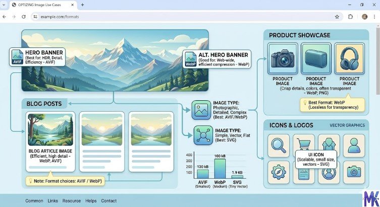
Logos and Icons
Always use SVG for logos and icons whenever possible. SVG produces the sharpest results at any display size, the smallest file sizes for simple graphics, and eliminates the need for multiple resolution variants. For icons that must be raster (such as complex photographic icons), use WebP at the smallest acceptable resolution.
Inline SVG icons directly in your HTML or use an SVG sprite system to combine multiple icons into a single file, reducing HTTP requests.
Screenshots and UI Images
Screenshots contain text, sharp edges, and UI elements that are sensitive to lossy compression artifacts. Use lossless WebP as the primary format for screenshots. If lossless WebP files are too large, try PNG as an alternative, but always prefer WebP lossless over PNG due to its better compression ratios. Avoid JPEG for screenshots entirely the blocky artifacts around text and UI elements are immediately visible and look unprofessional.
Infographics and Charts
Infographics that are created as vector graphics should be exported as SVG whenever possible. SVG infographics are perfectly sharp at any size, infinitely scalable, and typically much smaller than raster equivalents. If the infographic is too complex for SVG (for example, it contains photographic elements), use lossless WebP or PNG at the minimum resolution that makes all text clearly legible.
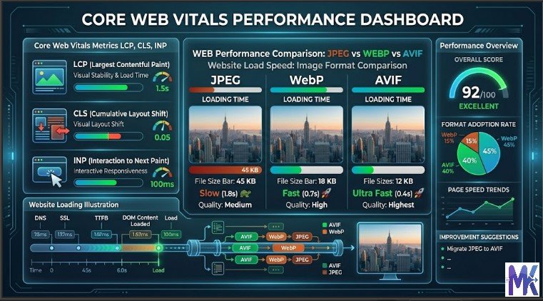
WebP vs AVIF vs JPEG (Real Performance Comparison)
File Size Comparison
In real-world testing, a standard photographic image saved at equivalent visual quality across formats produces roughly the following file sizes. Taking a benchmark high-quality photograph as the reference:
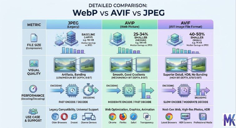
JPEG at 80 percent quality might produce a file of 150 KB. WebP at equivalent visual quality would produce approximately 100 to 110 KB roughly 25 to 35 percent smaller. AVIF at equivalent visual quality would produce approximately 65 to 85 KB roughly 40 to 55 percent smaller than JPEG. For simpler images with less complexity, the savings from AVIF over JPEG can exceed 60 percent.
For lossless compression of graphics and UI elements, PNG might produce a file of 200 KB for a complex screenshot. Lossless WebP of the same image would be approximately 140 to 160 KB around 20 to 30 percent smaller.
Visual Quality Comparison
At equivalent file sizes (rather than equivalent quality settings), AVIF produces noticeably better visual quality than JPEG and somewhat better quality than WebP, particularly at lower bit rates. JPEG shows characteristic blocking artifacts in areas of uniform color and around sharp edges. WebP degrades more gracefully, producing softer artifacts that are less objectionable. AVIF maintains the most detail and the most natural-looking degradation at equivalent file sizes.
For typical web use at recommended quality settings (75 to 85 percent), all three formats look good to the average viewer, and the quality difference is not the primary reason to choose one over another. The file size difference is the primary performance argument for AVIF and WebP over JPEG.
Speed and LCP Impact
In controlled testing, converting a hero image from JPEG to WebP at equivalent quality typically reduces LCP by 200 to 500 milliseconds on a standard mobile connection. Switching from JPEG to AVIF can reduce LCP by 400 to 700 milliseconds. The actual improvement depends on connection speed, server configuration, CDN caching, and the size of the specific image.
On Indian mobile networks where bandwidth is constrained, the impact is proportionally larger. A 40 percent reduction in image file size on a 10 Mbps connection saves a small fraction of a second, but on a congested 2 Mbps connection, the same 40 percent reduction in file size can save over a second of load time.
Which Format Wins in 2026?
AVIF is the technical winner for pure compression performance in 2026. WebP is the practical winner for the broadest compatibility with the smallest implementation complexity. The best strategy is to use both: serve AVIF to supporting browsers, WebP to browsers that support WebP but not AVIF, and JPEG as the final fallback. This three-tier approach delivers the best image formats for web performance across all browsers and devices.
How Images Affect Largest Contentful Paint (LCP)
What Is LCP?
Largest Contentful Paint (LCP) is a Core Web Vitals metric that measures the time from when a page starts loading to when the largest visible element in the viewport is fully rendered. The target for a good LCP score is under 2.5 seconds. An LCP between 2.5 and 4 seconds needs improvement, and an LCP above 4 seconds is considered poor.
Google uses LCP as a ranking signal in its search algorithm. A poor LCP score can directly harm your search rankings, reduce organic traffic, and impact conversions. LCP is measured for real users using Chrome User Experience Report (CrUX) data, meaning your actual ranking impact depends on how real visitors experience your pages — not just how your page scores on synthetic testing tools.
Why Images Are the Biggest LCP Element
Studies of real-world LCP data show that in approximately 70 to 80 percent of pages, the LCP element is an image typically a hero banner, featured photo, or large header image. This makes image optimization the single highest-impact action you can take to improve LCP.
The LCP clock starts when the browser begins loading the page and stops when the largest element is fully painted. For images, this means the browser must: make the DNS lookup and TCP connection, receive the HTML, parse the HTML to discover the image, make the request for the image file, download the image (which depends on file size and network speed), decode the image, and then render it to the screen. Every optimization that reduces image file size directly reduces the download step, which is typically the bottleneck.
How to Optimize Images for Faster LCP
Preload the LCP image using a link rel=”preload” tag in the HTML head. This tells the browser to begin downloading the image as soon as possible, before it has fully parsed the rest of the HTML. For hero images that are always visible above the fold, preloading is one of the most impactful optimizations available.
Convert the LCP image to WebP or AVIF format to reduce its file size without quality loss. Ensure the image is served at exactly the dimensions it is displayed not at the original camera resolution. Use a CDN to serve the image from a server geographically close to the user, reducing network latency. Avoid CSS background-image for the LCP element use an HTML img element instead, as browsers prioritize HTML img elements more aggressively in their loading pipeline.
Image Optimization Techniques for Faster Websites
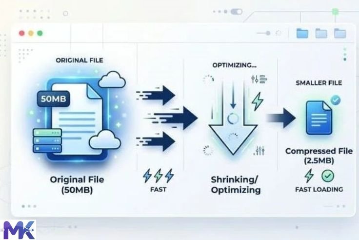
Resize Images Before Upload
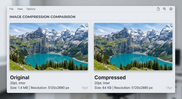
The most fundamental and highest-impact optimization is to resize images to their display dimensions before uploading them to your website. A photograph taken with a modern smartphone at 4032 x 3024 pixels has over 12 million pixels of data. If that image is displayed as a 800 x 600 pixel thumbnail, 93 percent of those pixels are wasted downloaded by the browser but never displayed.
Before uploading any image, determine the maximum width at which it will be displayed on your largest supported screen size, and resize the image to that width. Tools like mbtokb.site image compressor can resize images quickly. Content Management Systems like WordPress can be configured to automatically generate multiple sizes of each uploaded image.
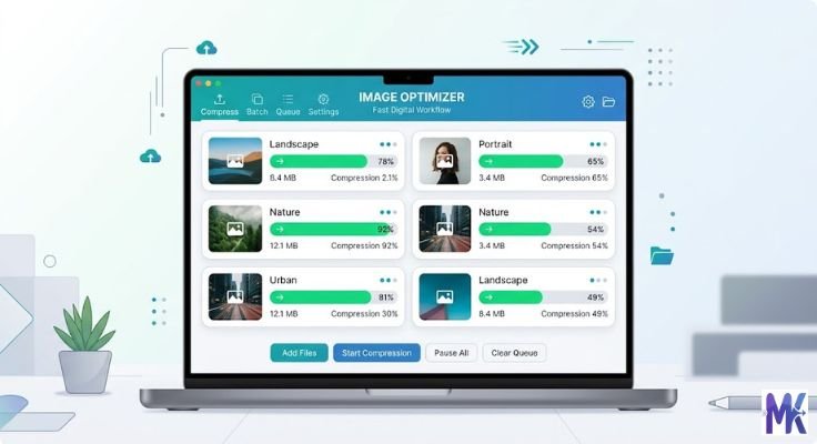
Compress Images Without Losing Quality
After resizing, compress images to reduce their file size further. For WebP and AVIF, a quality setting of 75 to 85 percent produces excellent visual results with significant file size reduction. For JPEG fallbacks, 80 to 85 percent quality is the sweet spot. Tools like Squoosh, TinyJPG, and ImageOptim make compression straightforward and show a side-by-side quality comparison so you can verify the output before saving.
Aim to keep photographic images under 200 KB where possible, and under 100 KB for images displayed at smaller sizes. Hero images can reasonably be 200 to 400 KB given their visual importance, but should not be served at 1 to 3 MB as is unfortunately common on many websites.
Use Next-Gen Formats (WebP, AVIF)
Converting your existing image library from JPEG and PNG to WebP and AVIF is one of the most impactful changes you can make for web performance. Even without any changes to image dimensions or quality settings, the format conversion alone typically reduces file sizes by 25 to 50 percent.
Most modern CMS platforms and hosting environments now support automatic WebP conversion. WordPress with the Imagify, ShortPixel, or EWWW Image Optimizer plugin can convert and serve WebP automatically. Cloudflare’s image optimization service automatically converts images to WebP for supported browsers. Static site generators can integrate tools like Sharp or libvips for build-time AVIF and WebP conversion.
Lazy Loading Implementation
Lazy loading defers the loading of images that are not currently visible in the viewport. Instead of loading all images on a page simultaneously when it first loads, lazy loading means images below the fold are only loaded when the user scrolls near them. This reduces the initial page load weight significantly and prioritizes loading the resources the user actually sees first.
Implementing lazy loading in HTML is as simple as adding the loading=”lazy” attribute to img elements. This native browser feature is supported in all modern browsers and requires no JavaScript library. However, never apply lazy loading to your LCP image — the above-the-fold hero image should always load eagerly.
Use CDN for Image Delivery
A Content Delivery Network (CDN) stores copies of your images on servers distributed around the world and serves them from the server geographically closest to each user. For Indian websites with a primarily Indian audience, using a CDN with nodes in Indian cities (Mumbai, Delhi, Chennai, Hyderabad) can reduce image delivery latency by 50 to 200 milliseconds compared to serving from a single server in a Western data center.
For global websites, CDN usage is even more critical. CDNs also handle edge caching, meaning frequently requested images are served from memory rather than disk, and can handle traffic spikes without performance degradation. Popular CDNs with good Indian coverage include Cloudflare, Fastly, AWS CloudFront, Akamai, and BunnyCDN.
Responsive Images (srcset and sizes)
The srcset attribute on HTML img elements allows you to specify multiple versions of an image at different resolutions, and the browser automatically selects the most appropriate version based on the user’s screen size and pixel density. This ensures Retina display users receive sharp images while standard display users are not penalized with unnecessarily large files.
A complete srcset implementation looks like: specifying the image at 400px, 800px, and 1200px widths, with the sizes attribute telling the browser how wide the image will be displayed at various viewport widths. The browser combines this information with its knowledge of the user’s screen pixel density to request the optimal image version, potentially serving a 400px image to a mobile user and a 1200px image to a desktop Retina user.
Using HTML Picture Element for Modern Formats
How to Serve WebP and AVIF with Fallbacks
The HTML picture element allows you to specify multiple sources for a single image and let the browser choose the best one it supports. This is the correct way to serve AVIF and WebP while maintaining JPEG fallback for older browsers. The browser evaluates the source elements in order and uses the first format it supports, falling back to the standard img element if none of the specified sources are supported.
Example Code for Implementation
The following code structure demonstrates how to serve AVIF, WebP, and JPEG in priority order with a complete fallback chain:
<picture>

  <source srcset="hero-image.avif" type="image/avif">

  <source srcset="hero-image.webp" type="image/webp">

  <img

    src="hero-image.jpg"

    alt="Descriptive alternative text for the hero image"

    width="1200"

    height="600"

    loading="eager"

    fetchpriority="high"

  >

</picture>
In this example, a browser that supports AVIF (Chrome, Firefox, Safari on recent versions) will download and display the AVIF file. A browser that supports WebP but not AVIF (older Chrome, older Safari) will use the WebP file. Any browser that supports neither will receive the JPEG. The width and height attributes prevent layout shift (improving CLS), loading=”eager” ensures the hero image is not lazy loaded, and fetchpriority=”high” signals to the browser that this is a high-priority resource to load immediately.
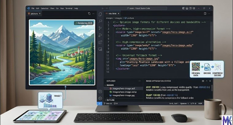
For responsive images with multiple sizes, you can combine srcset within the source elements to provide both format and size variants for even more granular optimization.
Recommended Image Sizes for Websites (India and Global)
Blog Images
The standard width for blog post body images is 740 to 1200 pixels, depending on your content column width. For most WordPress and CMS themes, 1200 pixels wide is a safe maximum that covers full-width content areas on all common screen sizes. Compress blog images to WebP format at 80 to 85 percent quality, targeting a file size under 150 KB for typical photography.
Featured Images
Featured images (also called post thumbnails) are displayed on archive pages, home pages, and social shares. A standard featured image size of 1200 x 630 pixels covers most use cases including Open Graph social sharing, homepage grids, and category pages. At this size, a well-compressed WebP image should be between 80 KB and 180 KB depending on content complexity.
Thumbnails
Thumbnails displayed in grids, sidebar widgets, or related posts sections should be 300 to 500 pixels wide. Because they are displayed at small sizes, they can be compressed more aggressively — target under 30 KB for thumbnails without visible quality loss. WebP at 75 percent quality is ideal for small thumbnails.
Social Media (Open Graph)
Open Graph images (used when your page is shared on Facebook, Twitter, LinkedIn, and WhatsApp) should be 1200 x 630 pixels in JPG or PNG format. Most social platforms still prefer or require JPEG or PNG for Open Graph images, as they fetch and cache the image themselves. Aim for a file size under 300 KB, ideally closer to 100 to 150 KB.
Favicon and Icons
The traditional favicon format is ICO, containing 16 x 16 and 32 x 32 pixel versions. Modern browsers also accept PNG favicons, and SVG favicons provide the best quality at any resolution. A complete favicon implementation in 2026 includes an SVG favicon for modern browsers (link rel=”icon” type=”image/svg+xml”), a PNG favicon at 32 x 32 pixels as a fallback, and an Apple Touch Icon at 180 x 180 pixels in PNG format for iOS home screen bookmarks.
Common Image Optimization Mistakes to Avoid
Uploading Full HD Images Without Compression
The single most common and costly mistake is uploading original, unedited photographs directly to a website without any compression or resizing. A modern smartphone camera produces JPEG files of 4 to 12 MB per photo. Uploading these directly to a website creates an immediate performance crisis a page with three such images would take 20 to 40 seconds to load on a typical Indian mobile connection. Always resize and compress before uploading. There is no legitimate reason to serve images larger than 1 to 2 MB for any web use case.
Using PNG for Photos
Using PNG format for photographs is an extremely common mistake that produces file sizes three to eight times larger than necessary. PNG’s lossless compression simply does not achieve meaningful compression on photographic data it preserves every pixel perfectly, but photographs do not benefit from pixel-perfect preservation because lossy compression at high quality settings is visually indistinguishable. Always use JPEG, WebP, or AVIF for photographs. Reserve PNG for graphics with transparency, screenshots, and UI elements.
Not Using Modern Formats
Continuing to serve only JPEG and PNG in 2026 leaves significant performance savings on the table. WebP has universal browser support and delivers 25 to 35 percent smaller files than JPEG. Converting to WebP with JPEG fallback is a low-effort, high-impact optimization that any website can implement. The argument that “my users might not support WebP” is no longer valid all browsers used by Indian internet users support WebP.
Ignoring Mobile Optimization
Serving the same large desktop images to mobile users is a critical performance mistake. A 1920-pixel-wide hero image served to a mobile phone that displays it at 390 pixels is sending over 98 percent wasted pixels to the user. Use responsive images with srcset to serve appropriately sized images to each device type. Mobile users, who represent the majority of Indian web traffic, should receive images no wider than 800 to 1000 pixels for most content.
Advanced Image Optimization Strategies (2026)
Using Image CDN (Cloudflare, BunnyCDN)
Image CDNs go beyond standard CDN delivery by also handling image transformation resizing, format conversion, compression, and optimization on the fly at the CDN edge. Cloudflare Images and BunnyCDN Optimizer can automatically convert images to WebP or AVIF, resize images based on the requesting device’s screen size, and cache the transformed version for future requests.
This means you can upload original high-resolution images to your storage system and let the image CDN handle all the optimization and delivery, removing the need for manual format conversion. For large websites with thousands of images, this approach is significantly more efficient than manually converting each image. Cloudflare’s image delivery has good coverage in India through their extensive Indian network, making it a particularly relevant choice for Indian websites.
Automatic Format Conversion
Server-side automatic format conversion can be configured at the web server level to convert images on the fly and serve WebP or AVIF to supporting browsers while serving JPEG or PNG to others. NGINX with the ngx_http_image_filter_module, Apache with mod_pagespeed, and various CMS plugins handle this automatically based on the browser’s Accept header, which declares which image formats the requesting browser supports.
This approach requires no changes to your HTML you continue referencing JPEG files in your code, and the server automatically serves WebP or AVIF based on browser capability. The trade-off is that real-time conversion requires server CPU, so it is best combined with a CDN to cache the converted versions.
Adaptive Image Delivery
Adaptive image delivery goes beyond responsive images by considering not just screen size but also network conditions, device capabilities, and user preferences. Some advanced implementations use the Network Information API and Client Hints to serve lower-quality images to users on slow connections and higher-quality images to users on fast connections.
A user on a congested 2G connection in rural India might receive a heavily compressed AVIF image at 50 KB, while a user on fiber broadband receives a higher-quality version at 200 KB same visual layout, dramatically different bandwidth consumption. Implementing adaptive delivery requires server-side logic or a specialized image CDN, but for high-traffic websites serving diverse audiences, the performance and user experience benefits are significant.
FAQs – Best Image Formats for Web Performance
For best performance:
- AVIF → Best for photos
- WebP → Strong fallback
- SVG → Best for logos and icons
- Lossless WebP → Best for UI and screenshots
Using the right format for each case ensures faster loading and better Core Web Vitals.
Image format does not directly affect SEO, but it impacts page speed. Faster images improve Core Web Vitals like LCP, which helps rankings. Alt text, filenames, and structured data are direct SEO factors.
AVIF is a modern image format with the best compression. It creates much smaller files than JPEG and WebP at similar quality. It is supported by all major browsers in 2026 and is worth using with WebP and JPEG fallbacks.
Use PNG for images that need lossless quality, such as screenshots, UI designs, or images with text and sharp edges. Also use it when a platform requires PNG. Otherwise, lossless WebP is usually a better choice.
Yes, converting JPEG and PNG images to WebP improves performance. Keep original files as backups and use them as fallbacks with the picture element. Tools like Squoosh, cwebp, or Sharp can automate the process.
WebP is better than JPEG in most cases. It gives smaller file sizes at similar quality and supports transparency. JPEG is only useful for very old browsers like Internet Explorer 11 or when your tools don’t support WebP. For modern websites, WebP should be the default, with JPEG as a fallback.